When you think about the installed base of both Windows and Visual Studio developer tools that will be used to create apps for Windows phones, it's almost embarrassing that Microsoft hasn't done better in this space. Last time I checked, WinMo was down to something like less than 3% of the smart phone market share. Ouch.
But, there's hope on the horizon, it seems. Although the name needs some work, Windows 7 Phone Series looks to have been completely rethunk from the ground up. It doesn't look like Windows (even Windows 7). Gone is the Start Menu and process monitor. Gone are the Windows-style menus. No longer are they trying to take Windows and stick it on a phone. Maybe.
Jesus Diaz of Gizmodo is already declaring the yet-unreleased phone to be better than the iPhone. Of course, a recommendation from the usually-wrong Diaz is about as meaningful as a plug from Rob Enderle. But despite the fact that there's typical Microsoft best-blog-posts-money-can-buy FUD already showing up, there just may be something here. It certainly looks to be a huge step in the right direction at the very least.
I was impressed enough to check out the demo.

Well, it looks rather iPhone-ish. The corners look a little sharp, and they've committed the same sin as the Nexus one by putting a fricking hardware back button at the bottom. The concept of "back" is context sensitive and not always appropriate, so doesn't belong in a hardware button. Plus, there's some other button whose purpose fails to jump out at me. Perhaps someone at Bletchly Park might have been able to divine the button's purpose, but I doubt it will jump out at the average phone user. Overall, though, it's not a bad concept drawing. It is just a drawing, though, so can't tell too much about the actual hardware. But we can tell a fair bit about the software, so let's look at that.
The first thing that jumped out at me is that they cut off February on the welcome scren. WTF? Is this some stupid attempt to be avante garde, or did they just not fucking notice? Attention to detail counts, remember? Despite the protestations of certain geeks, the iPhone isn't popular because it's elitist or avante garde. In fact, it's quite the opposite. It's popular because it's easy and fun to use. You can't compete by copying the superficialities, even if you are the 800 pound gorilla of the tech world.
But, we're months from release, so I'll cut them a little slack on that one. The next thing I notice - the status bar? Yeah, it's invisible. Which means that the desktop picture shows through behind the status icons. That means the user is responsible for picking a background image that's dark enough for the status bar icons to be legible. Don't leave shit like that to the user, they're bound to screw it up and blame it on you.
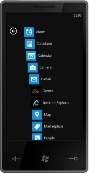
The thing that has Diaz's panties all in a bunch is the task-oriented workflow:

I don't get the fascination here. This isn't revolutionary. In fact, these are conceptually muddy buttons. They aren't distinct, and they don't accurately represent the things that a user is going to want to do. Why is Outlook a task rather than an application. It is just an application. Shouldn't it be "E-mail"? And why are Phone and People separate tasks? Who, exactly, are you going to call if not people? And what are you going to do with people if not call, text, or e-mail them? The concept of task-driven may be good, but this implementation of it seems shallow.
I applaud the desire to think differently and do something new, but it's not working here. I can almost visualize the meetings that resulted in this. Some manager from the Outlook group or marketing group insisted that e-mail be re-named Outlook for brand identity or simple ego issues. The Microsoft design-by-committee process is broken. Maybe less broken than it once was, but still broken. It takes good ideas from smart designers and engineers, chews them up, and spit them out as crap. Hopefully pretty crap, but still crap.
But, the Windows 7 Series Phone also has an application-centric view, just like the iPhone! Um, yeah. Great.
So, what's next? Ah, yes. Animations. Watch for a second before continuing on.
Okay, so we have eye candy at the press of the button on the main page that causes all the items to animate away. That's kinda cool, but why? What is the purpose? People often accuse Apple of having unnecessary eye candy, but if you look at it, you'll realize that most of it acts as powerful visual feedback. It's usually there to tell you something you might not otherwise notice. In this case, I guess you could argue that it tells you that you've moved to a new page, but that's not really something a user is bound to miss. I can forgive this one as showing off, though. These animations are hard to do right on a mobile phone, so I'll cut them a little slack for wanting to show what they can do in a demo.
But look at the keyboard animation. They take a second to fly in all the individual rows of keys to the keyboard. The first time, you're going to go "Cool!", every other time you're going to say "hurry the fuck up". Animations should never interfere with the user doing the natural thing they want to do. When I tap a text field, I expect to be able to type. Since this screen exists only to let the user search, why isn't the keyboard already being shown when I navigate there? Why do I even need to tap in the text field since it's the only control on the page? Oh, so Microsoft can show off their animations. No. You don't get it, Microsoft. It's not about you. It's about your user. Until you get that, your products will not be as good as they can be.
It's great that the Windows 7 Phone will have the infrastructure to do (hopefully GPU-powered) animations. It really is. Core Animation is the unsung hero of the iPhone's success from a technical standpoint. But it's nothing if not used right. Microsoft's UX team needs to get over the novelty of being able to animate and use the power to do so intelligently. Microsoft is using animation in this demo the way 90% of web designers used bevels and drop shadows in the 1990s, and that's not a compliment.
I know I'm coming across negative, but there's an awful lot of potential in this demo. There's the kernel of a truly remarkable mobile OS here, but you can already see how the design-by-committee is chewing on it.
Microsoft already has a base of developers who will jump on the platform if it's good, and quite a few consumers who will consider it if it's even in the same ballpark as the iPhone in terms of capability and functionality. Perhaps they realize they can shoot for mediocre and do a lot of advertising and FUD and show a profit. I'd really rather they did something truly great.
As it stands right now, I'm not betting on the Windows 7 Phone Series. But… here's my plea to the Microsoft designers and engineers: don't let stupid management decisions screw up what could be a great phone. At Apple, good design and engineering gets pushed and pushed hard from the top down. You don't have that luxury. Your "top" is filled with mediocre management types and your world is filled with bureaucratic in-fighting.
If you want to deliver a great phone, it needs to come from a ground-up revolution. Stick to your guns and fight against stupid decisions. Fight against marketing people making engineering and design decisions. Fight against the rush to get the damn thing out the door fast rather than right. Fight to prove me wrong. Please. You've got the ground floor of something awesome here, but it looks to me like your trajectory is set to completely miss awesome.
Please. Prove me wrong.
P.S. Here's a plea to Microsoft management involved with the phone. Let your people do their fucking jobs and stop second guessing their decisions. Your job should be to protect them from politics, infighting, and other forms of stupidity, not participate in it. Yes, it's a hard job, which is why you get paid more than them.


No comments:
Post a Comment